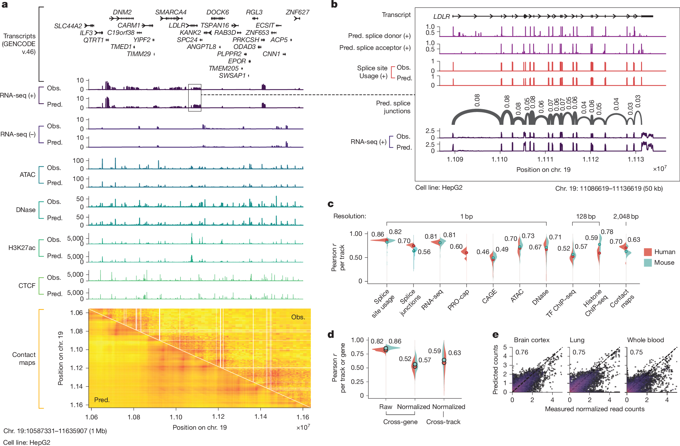
Fig. 2: Example of AlphaGenome track predictions and detailed performance evaluations.
From: Advancing regulatory variant effect prediction with AlphaGenome

a, Observed and AlphaGenome-predicted genome tracks within a 1-Mb held-out region of human chr. 19 (0-based coordinates: 10587331–11635907) in the HepG2 cell line. The y-axis scales for each assay are defined in the Methods section. Strand-specific tracks are denoted as positive (+) or negative (−), whereas strand-agnostic tracks are shown without a strand symbol. Contact maps are pairwise interaction matrices; therefore, both x and y axes display genome coordinate positions. RNA-seq, ATAC-seq and DNase-seq track predictions are at 1-bp resolution; H3K27ac and CTCF ChIP-seq are at 128-bp resolution; and contact maps are at 2,048-bp resolution. b, Example predictions with splicing. Base-pair-resolution AlphaGenome predictions for a 50-kb region highlighting detailed splicing (donor/acceptor sites, splice site usage and splice junctions) and RNA-seq predictions around the LDLR gene. c, Track prediction performance evaluation across different modalities. Violin plots display the distribution of Pearson correlations between predicted and observed tracks evaluated on held-out test intervals. Each violin plot is grouped by modality and split by organism (human in red; mouse in blue). Filled circles with accompanying numerical values indicate the mean Pearson r per assay group and organism. Splice junction, RNA-seq, PRO-cap, CAGE and ChIP-seq tracks were log(1 + x) transformed, whereas the remainder were untransformed. d, Evaluation of RNA-seq gene log-expression prediction on held-out test intervals. The leftmost panel assesses the Pearson correlation between predicted and observed log-expression values across all genes within individual tracks. The middle and rightmost panels evaluate the prediction of tissue or cell-type specificity using quantile-normalized expression values (detailed in Methods); correlations are computed either across genes per track (middle) or across tracks per gene (right). e, Splice junction count prediction. Predicted versus observed splice junction read counts (log(1 + x) transformed; n = 1,344,738) and Pearson r between them in selected human tissues known for having distinct splicing patterns49. Each hexagonal bin is coloured by the density of the data points in that bin, with warmer colours corresponding to higher density. The diagonal dotted line indicates perfect agreement (predicted = observed). More tissues are shown in Extended Data Fig. 2d. Obs., observed; Pred., predicted.
