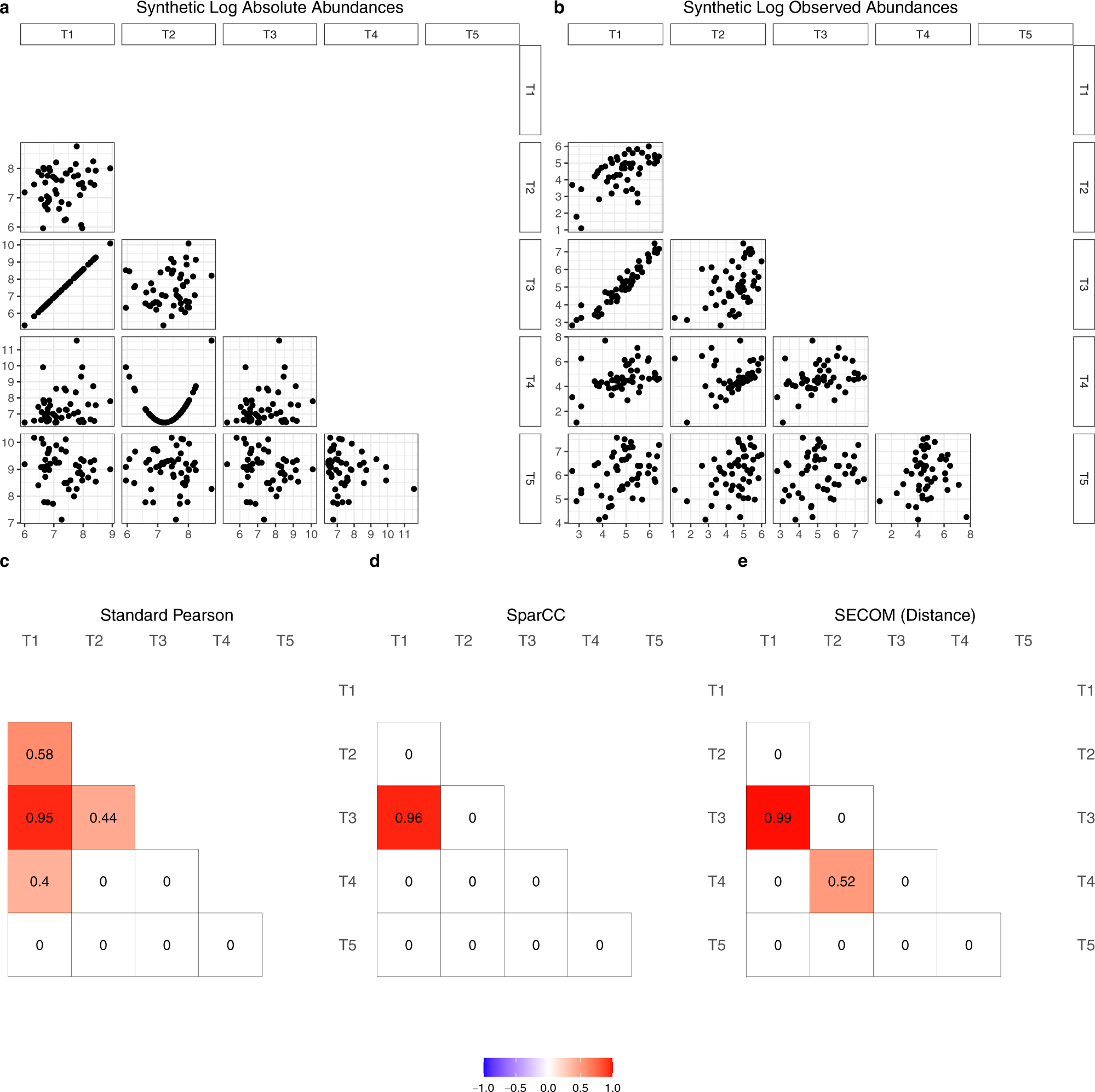
Fig. 1: A toy example showing the differences between correlation methods.
From: Linear and nonlinear correlation estimators unveil undescribed taxa interactions in microbiome data

All scatter plots and correlations provided in the figure are based on log abundances. a A total of 100 taxa were generated, where the true abundances in the ecosystem were generated using log-normal distributions. Taxa T1 and T3 are perfectly linearly correlated on a log scale, and taxa T2 and T4 are quadratically related. The remaining taxa are uncorrelated. Only the first 5 taxa (T1 to T5) are provided for the simplicity of exposition. Pairwise scatter plots of log abundances are provided in the lower triangle of the matrix. b Observed abundances were generated by incorporating sample-specific sampling fractions and taxon-specific sequencing efficiencies to the true abundances. Pairwise scatter plots of log abundances are provided in the lower triangle of the matrix. c–e Pairwise correlation coefficients using different methods. c The standard Pearson correlation coefficient (two-sided p value < 0.005, based on t-distribution, not corrected for multiple comparisons), d SparCC (estimate > 0.3), and e SECOM using distance correlation measure (two-sided p value < 0.005, based on the permutation test34, not corrected for multiple comparisons). The correlation coefficient ranges from −1 to 1, color-coded by blue to red, correspondingly.
